Update – 9 Aug 2021
Just a week after publishing this post, I received this newsletter from CSS Tricks.
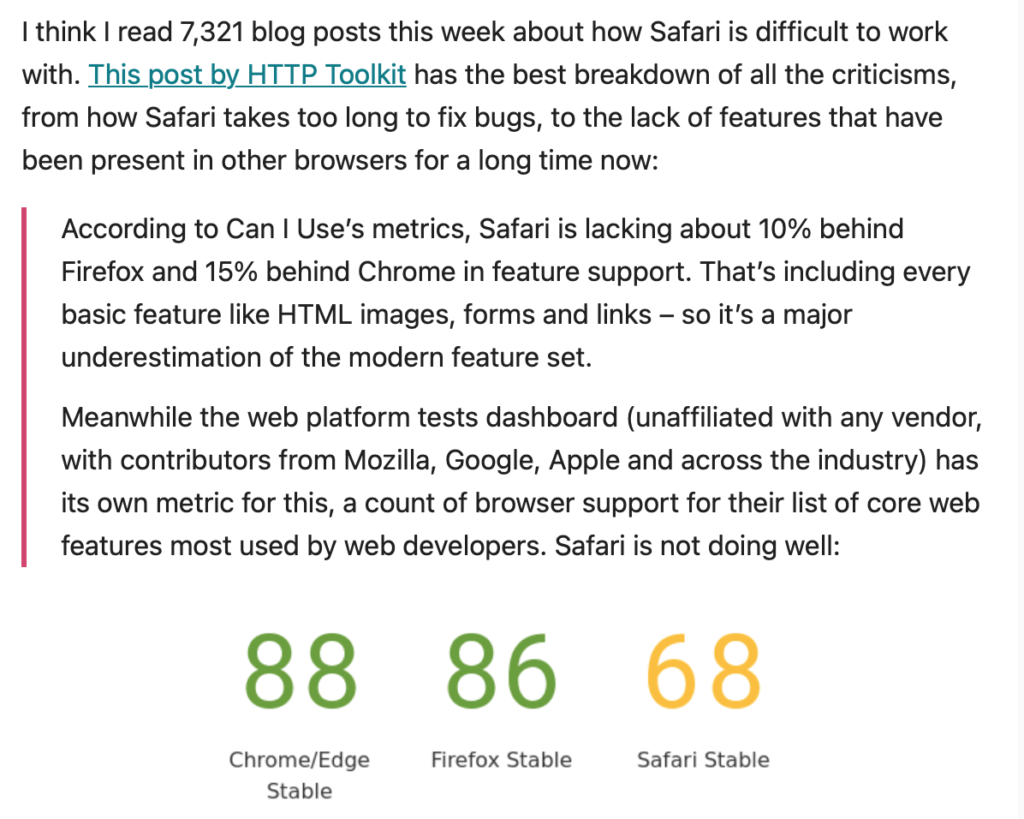
So it turns out I’m not the only developer who hates Safari. The post referenced by CSS Tricks is excellent, and it seems there are way more problems than I managed to find. Slow round of applause for Safari, please…
And my original post:
When we made websites back in the noughties, the bane of our lives was Internet Explorer. Despite being the most popular browser, it was full of bugs and idiosyncracies that meant for every website we built we’d then have to spend an extra half a day making it look right in IE. Some companies even started charging extra for online purchases made in older versions of IE.
Now we’re in 2021, and browser compatibility with HTML5 and CSS3 is something we only dreamed of in the bad old days. No lengthy standards declaration, no loose or strict or quirks modes, everything just works the same on all browsers. Except for Safari.
Where IE behaved like a wayward teenager that always wanted to do its own thing, Safari swings the other way to extreme pedantry, like the security guard that won’t let you in because your pass expired yesterday, even though they’ve seen you every single day for the last 5 years. These are my top Safari issues that have had me scratching my head:
1. Parallax Effects
CSS allows us to create parallax effects, where the background stays in place and the content scrolls over it. All we have to do is set the element to background-attachment: fixed.
.my-element {
  background-attachment: fixed;
}
Voilà, we’re done. But not in mobile Safari. Parallax effects don’t work in mobile Safari. End of.
Why?
Because, well, you know, computing all that stuff is a lot of hard work and we don’t want it to get too difficult for the poor little iPhone, it’s only a state of the art bit of kit costing over a grand. As someone says on this thread (on which the Apple developers are conspicuously silent), “Why do iPhones cost the earth if they can’t even support CSS from 10 years ago?”. Thanks Safari.
2. Google Fonts
You only have to take a look at this Stack Overload thread to see the wide range of issues developers have had getting Google Fonts to work in Safari and the various workarounds we’ve come up with.


It turned out my issue with Google Fonts and Safari wasn’t fixed by any of the many methods suggested by Stack Overflow but by making multiple calls to the font server, one for each font.
<!-- SAFARI SAYS NO -->
<link href="https://fonts.googleapis.com/css2?family=Montserrat|Kalam&display=swap" rel="stylesheet">

<!-- OK SAFARI -->
<link href="https://fonts.googleapis.com/css2?family=Montserrat&display=swap" rel="stylesheet">
<link href="https://fonts.googleapis.com/css2?family=Kalam&display=swap" rel="stylesheet">
Why?
Who knows. The frustrating thing is that since the fonts work fine in all other browsers the response from Google Fonts is obviously working with the first example, but in Safari I have to make two server calls, slowing down the page loading. If I had 10 fonts I’d have to make 10 server calls, and so on. Thanks Safari.
3. Videos
The first time I built a site using the HTML <video> tag, the video played fine in all browsers, then when I tried it on my iPhone it wouldn’t play at all.
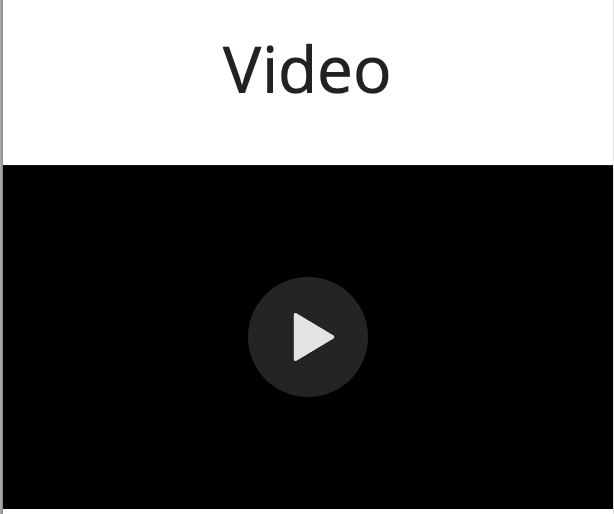
Some research showed it was because Safari requires the “playsinline” attribute to work correctly:
<!-- SAFARI SAYS NO -->
<video width="320" height="240" controls>
  <source src="movie.mp4" type="video/mp4">
</video>

<!-- OK SAFARI -->
<video width="320" height="240" controls playsinline>
  <source src="movie.mp4" type="video/mp4">
</video>
Why?
Because Safari needs to know that you want the video to be able to play. If you don’t say you want it to play, how am I supposed to know?
And why would you put a video on a page and not have it able to play? You wouldn’t. Thanks Safari.
4. Tap Targets
You build a lovely mobile responsive website. Your beautiful mobile menu works fine in preview and on Android, then when you try it on iPhone, the hamburger does nothing. Tap, tap, tap, nothing.

There are two ways we can detect a tap on mobile devices. One is to detect any tap on the screen at all, check what element was tapped and handle it accordingly:
// SAFARI SAYS NO
document.addEventListener("click", function (e) {
  if (e.target.id === "hamburger") {
    // Open the hamburger menu
  }
Oh but is that the Safari security guard tapping my shoulder? What’s going on here? Don’t you know that adding event listeners to the whole document is contrary to strict standards? What’s that, it works fine in every other browser? Well you’re not in another browser are you, you’re in Safari and you’ll do it our way, by adding the event listener directly to the element:
// OK SAFARI
hamburger = document.getElementById("hamburger");
hamburger.addEventListener("click", function(e) {
  // Open the hamburger menu
}
Why?
Because it’s the rules, that’s why. Remember, web best practices are not a guide for coders but for browsers to enforce rigorously and unhelpfully. Thanks Safari.
Once again I’m not the only person to experience this problem, as you can see from this Stack Overload thread.
5. Image Handling
We know how images work now, right? After all we’ve been doing this since the dawn of the web. We have the <img> tag or we can set background images which scale perfectly as the element changes size, and we can use the <picture> tag to set different source files for different screen sizes. Child’s play. We’ve got this.
Think again, says Safari. It might be obvious to all other browsers that if you set the width of an image then you want the height to scale automatically. But Safari has a great little quirk where if you set the image width as a percentage of a flexbox, it will stretch the image downwards, forcing you to set the height explicitly. height:auto, align-items:flex-start and aspect-ratio won’t help you either.
/* SAFARI SAYS NO */
.container {
  display: flex;

  img {
    width: 33%;
  }

}

/* OK SAFARI */
.container {
  display: flex;

  img {
    width: 33%;
    height: 297px;
  }

}
Hang on a minute, does that mean I have to manually calculate my image height for every breakpoint and set them explicitly? Yes, it does. And what about when I get below my lowest breakpoint and everything is dynamic? Well, you’ll just have to pick a value in the middle and fudge it. Isn’t that bad practice? Yes.
Why?
Who knows. Thanks Safari.
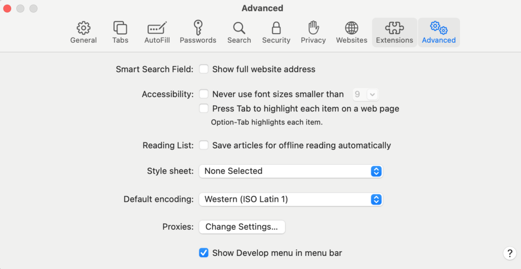
6. Hidden Developer Tools
Nothing makes you look professional like sitting in front of your client and googling “how to open devtools in Safari”. Safari is the only browser which requires you to explicitly turn the devtools on before you use them, which leaves me fishing for them before I can diagnose the problem.
Ok, I could just remember how to turn them on (Safari > Preferences > Advanced > Show Develop Menu In Menu Bar) but the only time I ever use Safari devtools is to figure out why a website isn’t working in Safari.
Why?
Presumably to hide these dangerous advanced features from the non-expert user. I mean if someone who didn’t know what they were doing started poking around with the devtools they could, um… do absolutely no damage whatsoever. Thanks Safari.
 Ici on parle français