A colour scheme might seem trivial, but the colours that we choose for a site or for a brand have an important role to play in the image we project to our potential customers, and getting it right can give us much more chance that our users carry out the actions we’re looking for.
First step: Colour Associations
The first thing we need to think about when designing a colour scheme is the associations that we have with various colours. We’re conditioned to associate certain colours with certain things, for example red with urgency or prohibition, or white with purity.
There are plenty of books on colour associations (see the end of this post) and it’s enough here to just give a few examples. There are no hard-and-fast rules. There is room to use your creativity, and most of all to let your intuition be your guide.

I’m a big fan of the Schmidt colour scheme. The dark grey implies quality and durability, whilst the red “active colour” (see later) gives the impression that they are contemporary and bold.

Sites for children use bright, bold colours that are attractive to little ones (I originally wrote this post for my French site, hence the French examples!)
Dark blue says serious, and is often used by banks, financial services, lawyers and so on, like this accountant, “Sigot”.
Green says environment, and anything to do with organic food, clean energy or anything else that benefits the environment will frequently use a green colour scheme.
Second step: The Colour Wheel
Once we’ve found the base colour(s) that give the right impression and associations for our brand, we now need to find complementary colours to create the colour scheme for our site. This where the colour wheel comes into play.
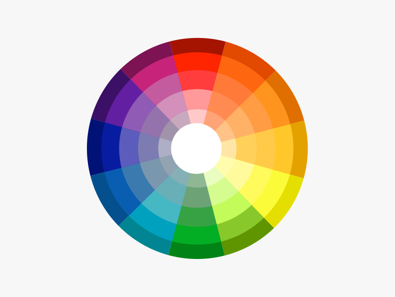
The colour wheel shows all the colours that exist (this is a simplified example), in the order that they pass naturally from one to the next. There are various ways to use the colour wheel, but all are based on the fact that colours which form certain angles to each other will either complement or contrast with each other. For a website we generally want two or three complementary colours, and another which stands out, known as an “active colour”, to show where users can click or otherwise interact with the page.
To begin with, we can find an excellent contrasting active colour by using the colour at 180 degrees from our base colour. Here, using colorschemedesigner.com I have used various shades of duck-egg blue, and it gives us a medium orange at 180 degrees to provide a contasting active colour.
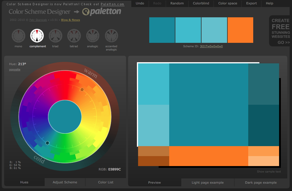
My own site is loosely based on this colour scheme, with a light blue base colour and orange active colour.
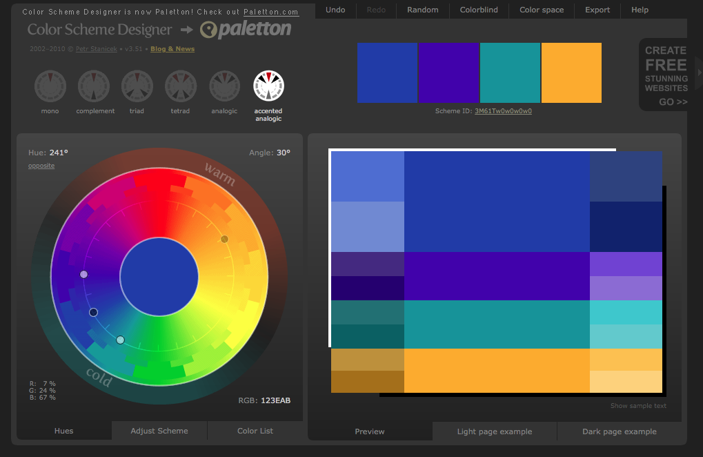
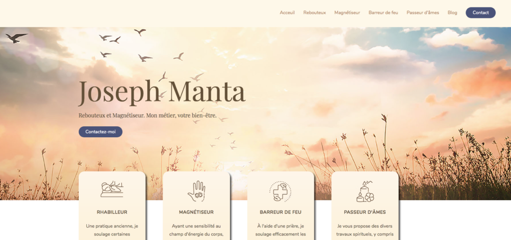
We can get a greater range of base colours if we use the colours to 30 degrees either side of our original base. Here a base colour of orange gives us a gold yellow and a blood-orange at 30 degrees either side, and a dark blue at 180 degrees.
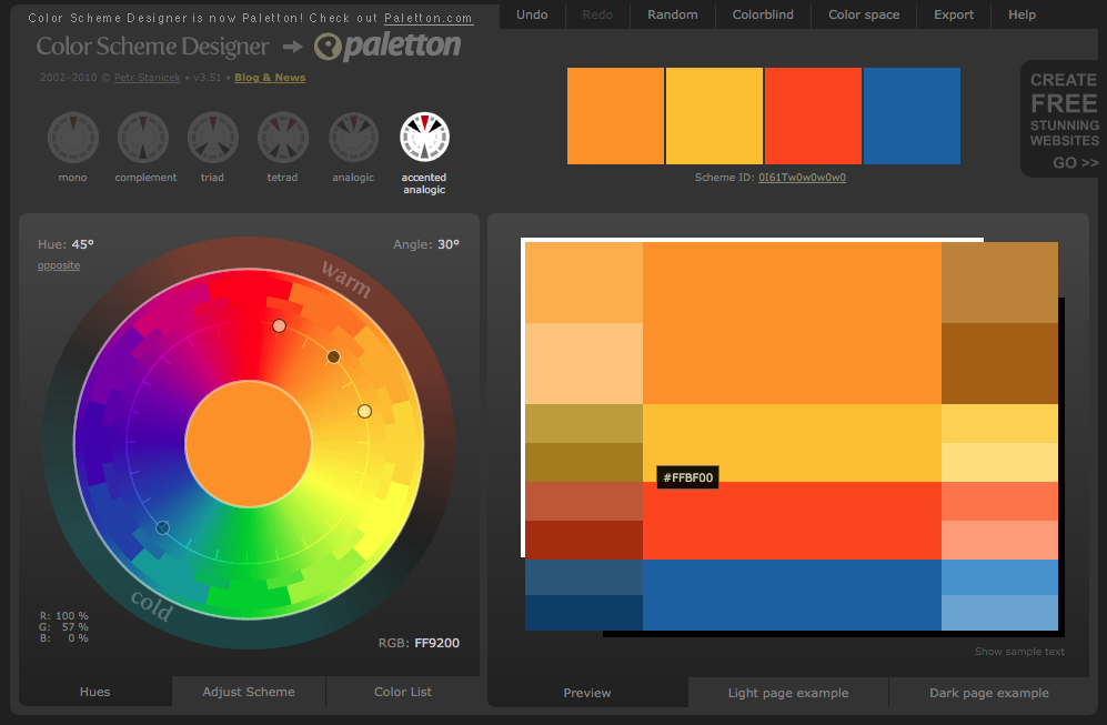
I used this scheme as a base for the site I designed for Joseph Manta.
There are no definitive rules when designing a colour scheme. It’s important to use imagination, creativity, experimentation, and above all to think about what the colour scheme makes us feel rather than what the rules say is correct. All that said, these two steps of colour association and using the colour wheel, give us an excellent start.