When coding a WordPress theme you’re going to need a mobile menu. The difficulty with a WordPress website is that the user might include nested submenus in their mobile menu. We need to be able to programatically allow these menus to open and collapse from the popup mobile menu, without knowing in advance where they might be.
Obviously the menus should not show by default, but it needs to be clear to the user that a menu item has a submenu, and the user should be able to open and close the submenu with a tap. Let’s get to work.
Creating our menu
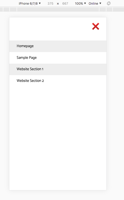
First we need to create our menu in WordPress. I’ve created a dedicated handheld menu, with nested menu items under “Website Section 1” and “Website Section 2”
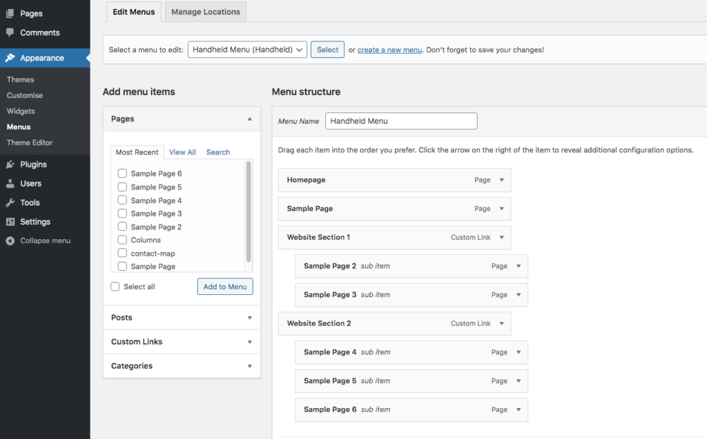
Note that the items with submenus are not pages or posts but “Custom Links”. This allows us to leave the URL blank to create a menu item that doesn’t actually link to anything at all.
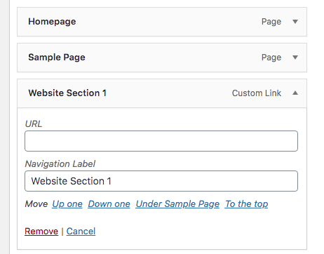
This creates an <a> tag without an href attribute, meaning the user can tap on the link and not be redirected to another page. This is essential because there’s no way for the mobile user to hover, and tapping is the only way to open the menu.
Looking in the inspector, we can see the <a> tag has no href attribute:
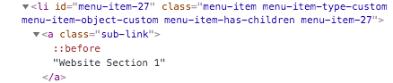
Notice also the class WordPress adds to the <li> element “menu-item-has-children“, which we’ll hook onto to open and close the child menu.
One last note on making the menu, WordPress won’t allow you to add a Custom Link to the menu with an empty URL, but it will allow you to add the Custom Link and then delete the URL, so do that.
Looking at the HTML
Let’s take a look at the HTML which WordPress churns out for us when we create a menu with nested submenus. Filtering out the classes and attributes which don’t interest us, the HTML produced by WordPress for our menu looks like this:
<ul id="handheld-menu">
     <li>
          <a>Homepage</a>
     </li>
     <li>
          <a>Sample Page</a>
     </li>
     <li class="menu-item-has-children">
          <a>Website Section 1</a>
          <ul>
               <li>
                    <a>Sample Page 2</a>
               </li>
               <li>
                    <a>Sample Page 3</a>
               </li>
          <ul>
     </li>
     <li class="menu-item-has-children">
          <a>Website Section 2</a>
          <ul>
               <li>
                    <a>Sample Page 4</a>
               </li>
               <li>
                    <a>Sample Page 5</a>
               </li>
               <li>
                    <a>Sample Page 6</a>
               </li>
          <ul>
     </li>
</ul>
We have everything we need here to target what we need using CSS selectors.
Opening and closing the submenus using jQuery
Placing a JQuery script in the footer, the first thing we’re going to do is to target the submenus and hide them.
<script>
    jQuery('ul#handheld-menu li.menu-item-has-children ul').hide();
</script>
What we’re doing here is targeting only the <ul> elements which are children of the <li class="menu-item-has-children"> elements which are in turn children of the <ul id="handheld-menu">, and hiding them with the jQuery hide() method. Remember in WordPress we must write jQuery() in longhand and not the shorthand $(), otherwise it won’t play nice.
The next thing we want to do is to show that submenu when the user clicks on the <a> tag that preceeds it (the one without an href attribute). We slide it in using the jQuery slidetoggle() method, but first we have to select it.
jQuery('ul#handheld-menu li.menu-item-has-children > a').click(function() {
		jQuery(this).next().slideToggle();
});
Let’s take a closer look at what’s going on here. First we’re selecting any <a> element which is a direct child of any <li class="menu-item-has-children"> element, which is in turn a child of our <ul id="handheld-menu">. Then we’re assigning a clickhandler to it to trigger the callback function when a click event is registered.
The click function references the original selector using this, then moves on to the next sibling using the jQuery .next() method. The next sibling on from the <a> element will always be the <ul> element containing our submenu, so now all we need to do is slide it in or out of view using the .slideToggle() method.
Now our full JavaScript code looks like this:
<script>
	jQuery('ul#handheld-menu li.menu-item-has-children ul').hide();
	jQuery('ul#handheld-menu li.menu-item-has-children > a').click(function() {
		jQuery(this).next().slideToggle();
		jQuery(this).toggleClass('closed-link');
	});
</script>
Adding open/closed symbols on the submenu items
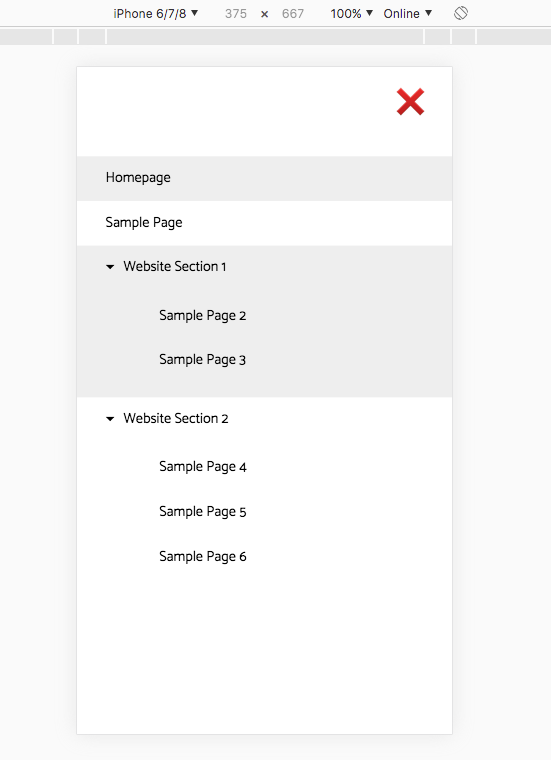
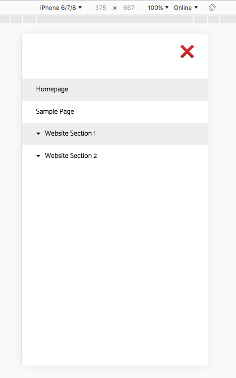
We now have submenus that open and close when the user taps on the “Custom Link” which we created earlier. But we are still missing an important feature. At the moment there is nothing to show the user that they can tap on the Custom Link to reveal the submenu, it looks just like another menu item:
What we’re going to do now is add a sub-link class to every <a> element which is a child of a <li class="menu-item-has-submenu"> element, then we can target this class in CSS and add an icon to the ::before pseudo-class.
First the jQuery to add the sub-link class
jQuery('ul#handheld-menu li.menu-item-has-children > a').addClass('sub-link');
And the CSS to display a downwards pointing triangle before each item
a.sub-link::before {
    content: '\25be';
    margin-right: 10px;
}
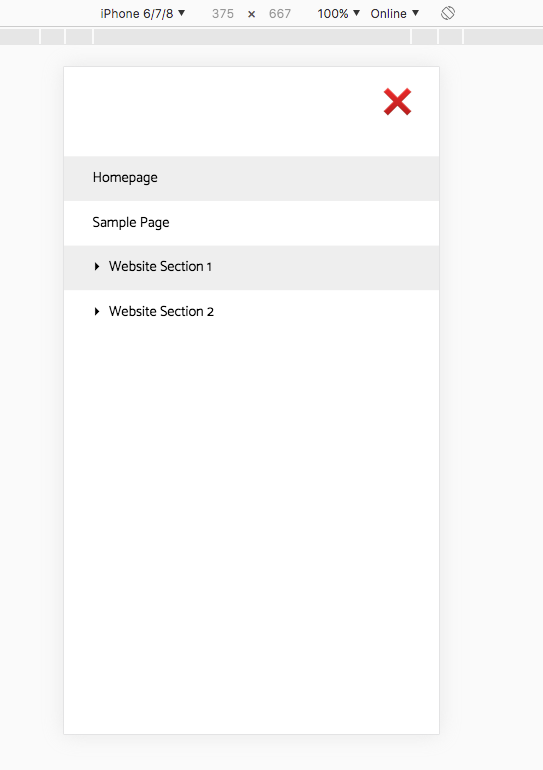
Now every menu item which is a Custom Link and reveals a submenu when tapped will have the downward pointing triangle before it.
But this isn’t quite what we want. We want the arrow to point down when the submenu is open but sideways when it’s closed. To achieve this we’ll edit our jQuery which adds the sub-link class, to also add a closed-link class by default:
jQuery('ul#handheld-menu li.menu-item-has-children > a').addClass('sub-link closed-link');
We’ll add another CSS rule to make the triangle point sideways when the element has both sub-link and closed-link classes:
a.sub-link.closed-link::before {
    content: '\25b8';
}
And add a line to our click function to toggle the closed-link class:
jQuery('ul#handheld-menu li.menu-item-has-children > a').click(function() {
		jQuery(this).next().slideToggle();
		jQuery(this).toggleClass('closed-link');
	});
Now we’re finished. Our submenus will be closed by default, and their opening links will have sideways pointing triangles:
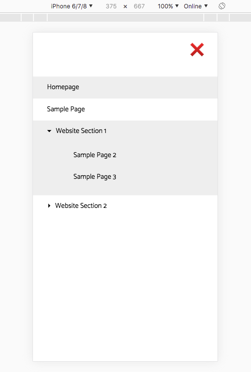
But once the user taps on a submenu, the menu will open and the triangle will point downwards:
Our final code
jQuery:
<script>
	jQuery('ul#handheld-menu li.menu-item-has-children ul').hide();
	jQuery('ul#handheld-menu li.menu-item-has-children > a').addClass('sub-link closed-link');
	jQuery('ul#handheld-menu li.menu-item-has-children > a').click(function() {
		jQuery(this).next().slideToggle();
		jQuery(this).toggleClass('closed-link');
	});
</script>
CSS to add the triangles:
a.sub-link::before {
    content: '\25be';
    margin-right: 10px;
}

a.sub-link.closed-link::before {
    content: '\25b8';
}
And although we didn’t discuss it here, this is the basic CSS used to style the menu itself:
.mobile-menu-modal {
    position: fixed;
    left: 0;
    top: 0;
    width: 100%;
    height: 100%;
    background-color: white;
    justify-content: flex-start;
    align-items: flex-start;
    padding-top: 100px
}

.mobile-menu-modal ul {
    display: flex;
    flex-direction: column;
    align-items: flex-start;
    margin: 0;
    padding: 0;
    margin-top: 0;
    list-style-type: none;
    width: 100%;
}

.mobile-menu-modal ul li {
    padding: 1em 2em;
    width: 100%;
}

.mobile-menu-modal > ul > li:nth-child(odd) {
    background-color: #eee;
}

.mobile-menu-modal ul li a {
    text-decoration: none;
    color: black;
}

.mobile-menu-modal ul ul {
    padding-top: 20px;
    padding-left: 60px;
}

.mobile-menu-modal ul ul li {
    padding-left: 0;
}
 Ici on parle français